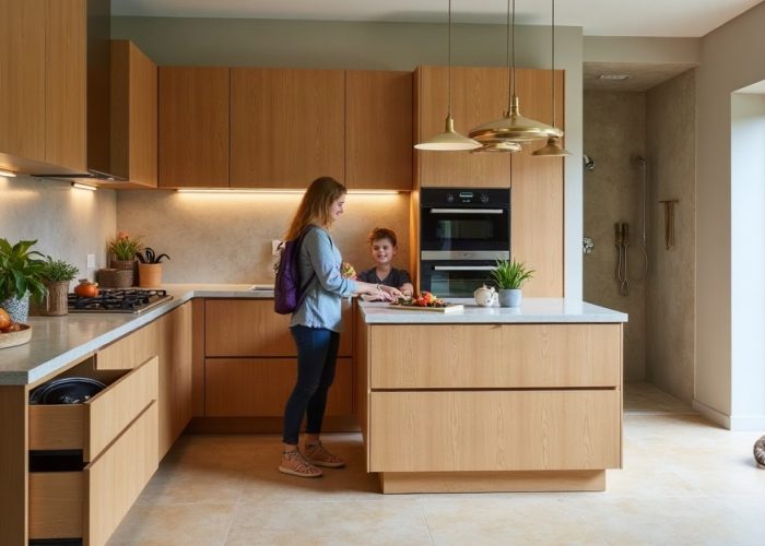
Most kitchen tiles that feel off have nothing technically wrong with them. The tiles are fine individually. The problem is they were chosen in isolation: backsplash picked one day, floor tile another, countertop last. The result is a kitchen that looks assembled rather than designed.
Designing a cohesive kitchen design with tile is about building a system where every surface speaks the same visual language. This guide walks through each decision in order so nothing conflicts and nothing feels random.
Start with One Anchor Tile and Build Around It
The most common mistake in kitchen tile design is trying to choose everything at once. Instead, identify one anchor tile, the surface that will have the most visual presence and make every other decision relative to it.
In most kitchens, the backsplash is the anchor. It sits at eye level, runs the length of the main wall, and is the first thing people notice. Choose your backsplash tile first, then select floor tile, countertop material, and cabinet finish that support it rather than compete with it.
How to apply this:
- If your anchor tile is bold like a deep-colored gloss or a dimensional relief tile, keep the floor tile and countertop calm and neutral.
- If your anchor tile is neutral like a concrete-look ceramic or soft white subway, you have more flexibility to add texture or pattern on secondary surfaces.
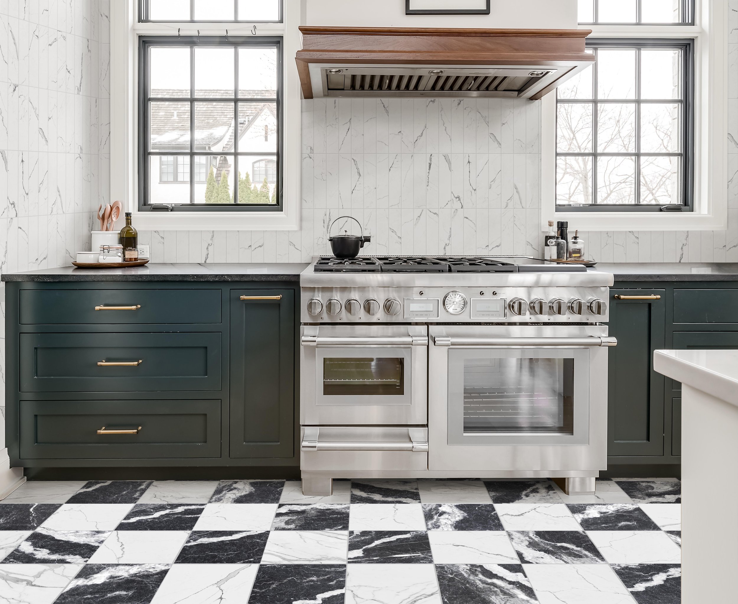
- If you want pattern on the floor, keep the backsplash simple. Two competing patterns in a single kitchen almost never work.
The Caementum Collection from Galactic Tiles, a clean concrete-look ceramic works well as an anchor tile precisely because its neutrality gives every other surface room to breathe.
How Tile Size Affects Kitchen Proportion and Flow
Tile size does more than fill space, it controls how large or small a kitchen feels and how much visual weight each surface carries.
General rules for kitchen tile sizing:
- Large format tiles (12″x24″ and above) make small kitchens feel bigger by reducing grout lines. They work well on floors and as full-height backsplashes in open-plan kitchens.
- Smaller tiles (4″x12″ subway, mosaic) add texture and detail. They suit traditional, transitional, and eclectic kitchens but can feel busy in compact spaces.
- Mixing sizes works but only when there is a clear size relationship. A 12″x36″ wall tile paired with a 12″x24″ floor tile shares a common dimension. Random size combinations look accidental.
Keep the largest tile format on your floor or as a full-height backsplash. Smaller accent tiles should appear in contained areas, behind the range, as a border, or as a transition strip to not spread across competing surfaces.
Matching Tile Finishes Across Your Kitchen Surfaces
Finish is the variable most people underestimate. Two tiles in the same color but different finishes: one matte, one gloss will read as completely different materials in natural light. Mixing finishes without intention creates visual noise.
The three main finishes and where they work:
- Gloss: Reflects light and makes spaces feel brighter and larger. Best on backsplash walls where light reflection is an advantage. Avoid on floors, gloss tiles show every footprint and can be slippery when wet.
- Matte: Absorbs light and reads as warmer and softer. Works on both floors and walls. Easier to maintain on high-traffic surfaces. Pairs well with natural wood cabinetry and stone countertops.
- Textured / Relief: Three-dimensional surface that catches light differently depending on angle. Creates depth on a feature wall or backsplash.
For a cohesive kitchen, limit yourself to two finish types maximum across all surfaces. A matte floor with a gloss backsplash is a clean, intentional contrast. A matte floor, matte backsplash, and textured feature wall behind the range is a complete system. Four different finishes across four surfaces is where things fall apart.
Grout Color Is a Design Decision, Not an Afterthought
Grout color determines whether tile joints disappear into the surface or become a visible part of the pattern. It is one of the highest-impact, lowest-cost decisions in kitchen tile design and one of the most consistently underestimated.
How to choose grout color:
- Matching grout (same tone as tile): Makes the tile surface feel seamless and continuous. Maximizes the material feel of the tile itself. Works best with large-format tile where you want the surface to read as a single plane.
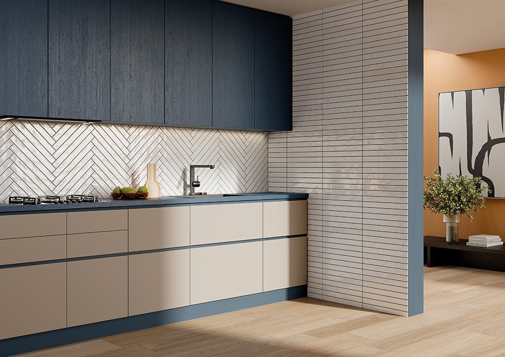
- Contrasting grout (darker or lighter than tile): Makes the tile grid visible and emphasizes the layout pattern. Can be intentional and graphic with subway tile or herringbone layouts. Requires precise installation, uneven grout lines show clearly.
- White grout: Works with almost any white or light tile but requires more maintenance. Grays slightly over time in high-moisture environments like kitchens.
- Warm gray or greige grout: The most forgiving option for neutral kitchens. Hides variation, works with wood cabinetry, and does not read as clinical the way bright white grout can.
A practical rule: if you are unsure, choose a grout color that is one shade darker than your tile. It tends to complement rather than clash, shows less maintenance over time, and reads as intentional rather than matched by default.
How to Combine Floor and Backsplash Tile Without Clashing
Floor and backsplash tile do not need to match but they do need to relate. The relationship can be tonal (same color family, different texture), scalar (same size family, different orientation), or material (same material type, different format). What does not work is two tiles that have no shared characteristic.
Three reliable floor and backsplash combinations:
- Neutral floor, statement backsplash: Large format matte floor tile in a light stone or concrete tone. Bold gloss or textured backsplash behind the range or along the main kitchen wall. The floor recedes; the backsplash becomes the focal point.
- Tonal layering: Floor and backsplash in the same color family but different tones, warm white floor with off-white or greige backsplash. Subtle, sophisticated, and easy to live with long-term.
- Contrasting texture, unified color: Same neutral tone on floor and backsplash, but different finishes: matte floor, gloss backsplash, or smooth floor, relief backsplash. The color creates cohesion; the texture creates interest.
Avoid: mixing warm-toned and cool-toned tiles on adjacent surfaces. A warm beige floor next to a cool gray backsplash will fight each other in natural light and read as a selection error rather than a design decision.
When to Use Bold Tile and When to Stay Neutral
Bold tile: deep colors, strong pattern, dimensional relief, oversized format works when it is used with restraint. The kitchen projects that feel most considered are usually ones where one surface is bold and everything else steps back.
Use bold tile when:
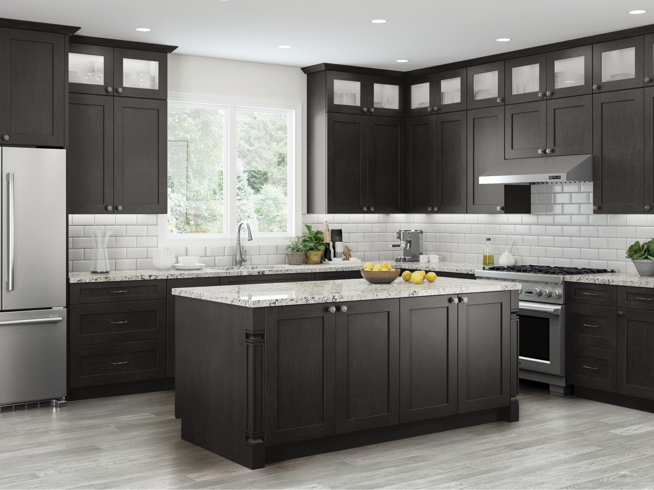
- The rest of the kitchen, cabinets, countertops, appliances is neutral or natural in tone.
- You want one specific wall or surface to function as a design focal point.
- The kitchen has enough natural light to handle color without feeling heavy or dark.
- You are prepared to commit. Bold backsplash tile is not easily changed.
Stay neutral when:
- Your cabinetry or countertop is already making a design statement.
- The kitchen is small and you want it to feel open and light.
- You are designing for resale or a broad market.
- You want the flexibility to change accessories, hardware, and decor without retiling.
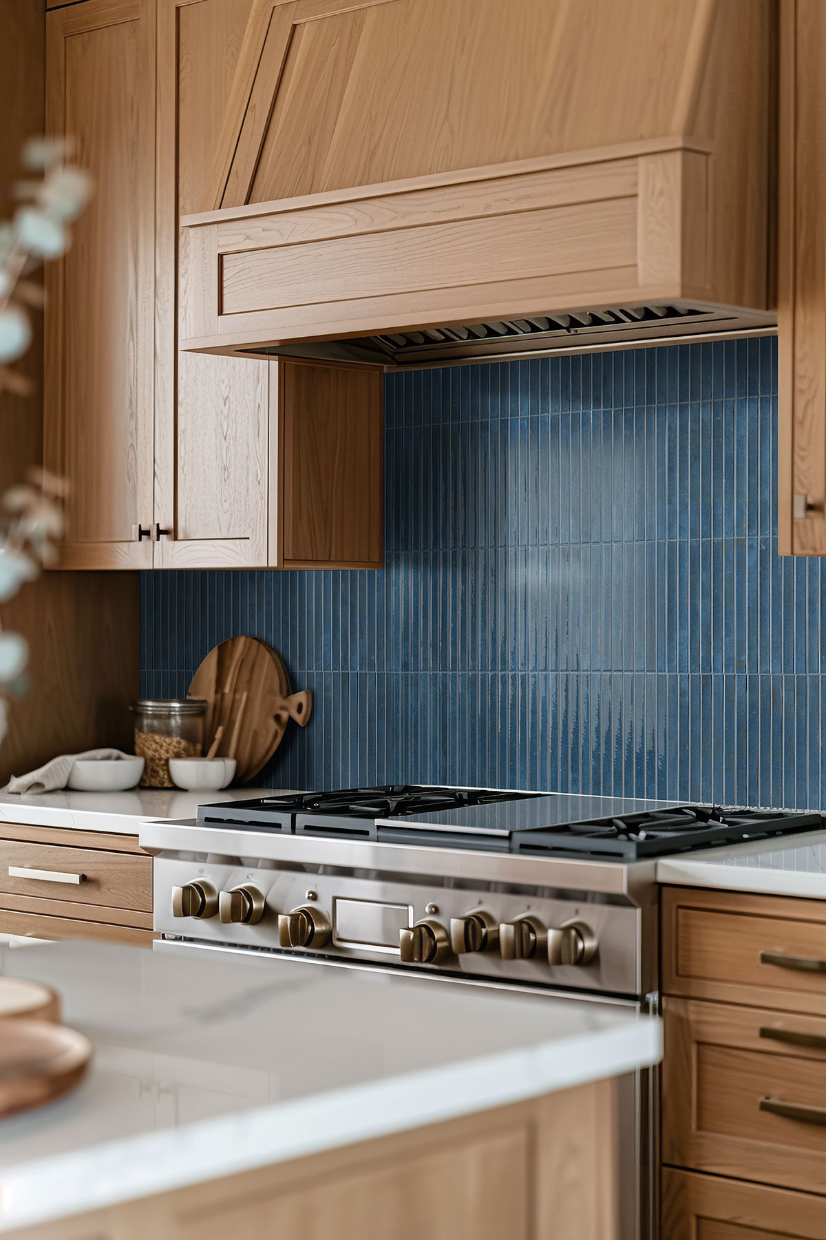
The transformation from a worn, dated kitchen to a confident, modern space often comes down to one bold material decision applied to one surface. Deep gloss backsplash tile against warm wood cabinetry is a design choice that changes the entire character of a room without requiring a full renovation.
Frequently Asked Questions:
No. Floor and backsplash tile do not need to match but they need to relate. Shared tone, material type, or size family creates cohesion without requiring identical tile on every surface.
Gloss tile is the most practical choice for kitchen backsplashes. It reflects light, makes spaces feel larger, and is easy to wipe clean. Matte finish works well for a warmer, softer look but requires slightly more maintenance on a high-contact surface.
Yes. Large format tile 12″x24″ or larger can actually make a small kitchen feel bigger by reducing the number of grout lines in the visual field. The key is keeping the large tile on one surface and avoiding pattern tile in the same space.
Key Takeaways
- Choose your anchor tile first: usually the backsplash and build every other surface decision around it.
- Tile size affects proportion. Mix sizes only when tiles share at least one common dimension.
- Limit yourself to two finish types across all kitchen surfaces.
- Grout color is a design decision. Matching grout reads seamless; contrasting grout emphasizes the layout pattern.
- Floor and backsplash tile should relate through color, scale, or material even when they do not match.
- Bold tile works best on one surface with everything else kept neutral.
Many homeowners assume a cohesive kitchen requires matching everything to the same material and color. In practice, the most successful kitchen tile designs use contrast intentionally, different finishes, different scales while maintaining a consistent tone and material relationship across surfaces. The goal is not uniformity. It is harmony. Choosing an anchor tile first and relating every other decision to it is the simplest way to achieve that result without starting over.